How I helped a new studio build trust from zero — before they had a single case study to show.
A brand new studio. No clients, no case studies, no reputation. Here's how I built a page that made none of that matter.

Overview
Fynex.Studio is an AI-powered product studio built for founders who need a real engineering partner — not another agency that disappears after the wireframes. I designed the full landing page and wrote every word of copy, from hero to footer.
The Brief
Fynex was a brand new studio with no case studies, no testimonials, and no track record under this name. The challenge wasn't just design — it was building trust from zero. The page had to do the work that years of reputation normally does.
The Problem With Most Agency Sites
Before touching Figma, I audited competitor sites including DevMonks, Webflow agencies, and boutique studios. The pattern was the same everywhere — generic headlines, services listed as features instead of benefits, process sections that exist to fill space, and no real point of view.
The opportunity was obvious. Almost no studio in this space had a genuine voice. Most of them read like they were written by the same AI prompt.
Working With AI — On My Terms
The timeline was tight, so I tried to use AI to speed up the case study and copywriting process. Most of what came back was okay for a first draft — usable as inspiration, not as a final output. The copy was generic in the exact way I was trying to avoid.
So I shifted the approach. Instead of generating and accepting, I used AI as a thinking partner — pushing back on outputs, rewriting what didn't feel right, and mixing its speed with my own design instincts. That combination ended up being faster than my regular workflow without sacrificing the quality I cared about.
Decision 1: Lead With Tension, Not Description
In design, the hardest thing is often writing the right copy. With LLMs you can generate 20 headline variations in one prompt — but most of them are exactly what every other landing page already has. I wanted something that worked as a hook AND made the visual pop. Something out of the box, short, and with enough tension to make you stop.
After a lot of iteration, the first version I landed on was: "Your next Big Product, Engineered to Actually Ship."
It's passive. It implies competitors don't ship — which reads as insecure, not confident. So I kept pushing.
The final headline: "Most agencies build. We ship."
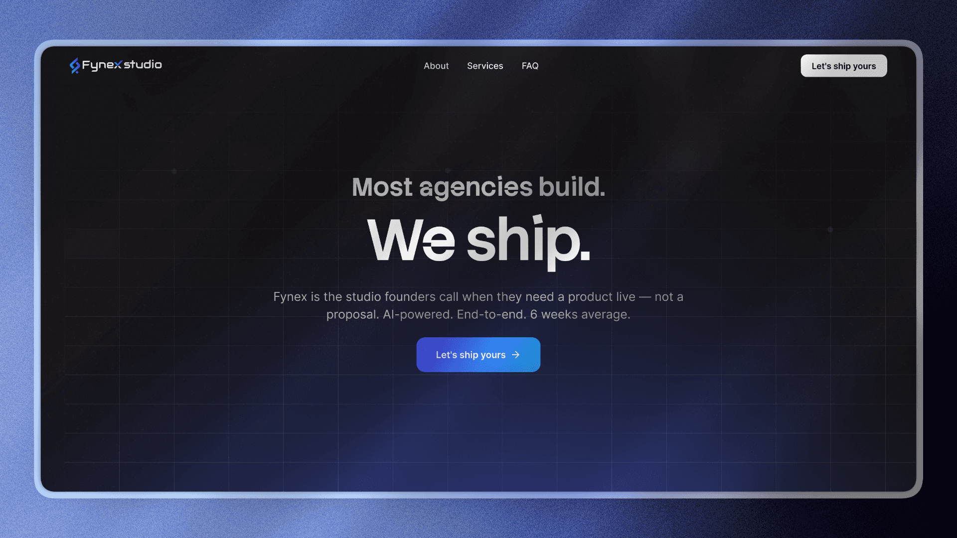
Line one names the category and dismisses it in the same breath. Line two is the statement — two words, no explanation needed.
The size difference between the lines was intentional. Line one at 55% opacity, ~42px. Line two massive, full blue. The design and the copy make the same argument.
Decision 2: Copy Before Layout
Every section was written before it was designed. Non-negotiable.
Most designers do it the other way — build the layout, fill it with placeholder copy, retrofit the real words later. The result is copy that serves the design instead of design that serves the copy.
For Fynex, the copy determined the layout. The contrast section exists because the copy demanded two columns. The philosophy statement exists because the copy needed room to breathe at large scale. The "Who This Is For" block exists because that paragraph only works when the reader feels directly addressed — and that only happens at a certain size and weight.
Decision 3: The Contrast Section Over a Features Grid

The original approach was a tabbed services section — Frontend, Backend, AI/ML, Mobile. It looked structured but created a real problem: it made visitors work to understand what Fynex does. Tabs add friction at the exact moment you need clarity.
I replaced it with a two-column contrast layout.
Left column — "The usual pain" — muted, grey, past tense feeling. Right column — "The Fynex way" — dark background, blue text, present tense.
No cards. No icons. Just the contrast doing the work.
The closing line underneath: "94% of our clients come back for their next product. That's not a coincidence."
One line of social proof that lands harder than any testimonial carousel.
Decision 4: Address the Biggest Objection Head-On
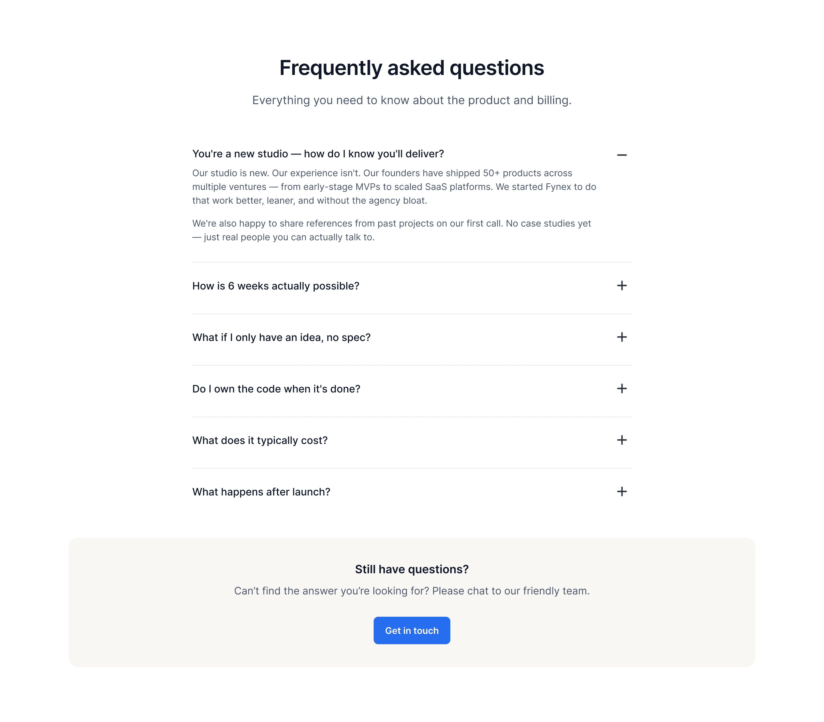
New studio. No public case studies. The elephant in the room.
Most new studios either ignore this or bury it. I put it first in the FAQ:
"You're a new studio — how do I know you'll deliver?"
The answer doesn't deflect:
"Our studio is new. Our experience isn't. Our founders have shipped 50+ products across multiple ventures. We're happy to share references from past projects on our first call — real people you can actually talk to."
Acknowledging the weakness directly is more persuasive than pretending it doesn't exist. Visitors who read that answer leave more confident, not less.
Decision 5: Cut Ruthlessly
V1 had sections that didn't belong — a scrolling tag cloud mixing "Freelancing, VCs, Podcasts", a SaaS-style feature list ("Offline mode, Infinite depth, AI Superpowers"), and a pentagon chart for industry verticals.
All three were cut.
Each one was borrowed from a different type of site — a job board, a project management SaaS, a data analytics platform. None of them were Fynex. Cutting them wasn't a design decision, it was a positioning decision. A page that tries to look like everything looks like nothing.
The final page has 9 sections. Every one has a specific job. None of them are decoration.
Final Page Structure
Hero — establishes the position in 4 words
Philosophy statement — humanises the studio
Contrast section — dismantles the competition without naming them
Tech stack strip — proves technical credibility silently
AI credibility block — backs up the "AI-powered" claim
Who This Is For — pre-qualifies the right leads
How It Works — removes anxiety about the process
FAQ — kills the remaining objections
Final CTA — converts the convinced
What I Learned
The hardest part of this project wasn't the design. It was resisting the temptation to add. Every section that didn't make the cut was cut for a reason — and making that call, without a client pushing back, requires genuine conviction about what the page actually needs to do.
Copy and design are the same discipline when they're done right. The best decision I made on this project was treating them that way from the start.