OdoDash: I Forked a Vehicle Tracker Because the Design Bugged Me
My bike ran on a Google Sheet. I found a great open-source tracker with a dated interface, so I redesigned it and now maintain the fork.

The One-Line Summary
I took May, an open-source vehicle tracker by Danny McClelland, gave it a modern interface, and now run it on my home server to track my bike.
Project Metadata
My role: Designer and maintainer of the fork. The backend and core features come from May.
Original project: May by Danny McClelland
Timeline: Started September 2026. My releases 0.45.1 to 0.46.1 shipped 16 to 23 Oct 2026.
Status: Live on my home server. I use it every day.
Stack: Python, Flask, HTMX, Tailwind CSS, Chart.js. Docker and PWA.
Why This Existed
I ride a Honda X Blade. I’ve had it for a year and three months.
From day one I tracked it in a Google Sheet. Every time I filled up, I logged it and worked out how many km I got per liter. I noted the odometer so I’d know when the engine oil was due. Every accessory I bought for the bike went in there too.
Everything was manual. Every entry, every calculation. With a few rows it was fine. As the data grew, managing it got boring. Cost per km isn’t a hard formula, but I didn’t want to write one more calculation into a sheet.
I was also getting into self-hosting at the time. So instead of a better sheet, I started looking for an app I could run myself.

Choosing May
I went looking for open-source options. There were a few. One of them had a really nice design, but it didn’t pass my test: it had no API.
In 2026, an app without an API is a dead end for me. I want to log a refuel from Telegram, let an agent read my data, and run backups automatically. All of that needs an API. May had one. So I hosted May on my server.
“Why does the design look so outdated?”
That was my first reaction when I opened it. The backend was solid, but the interface wasn’t:
The dashboard looked old.
The navigation was hiding some of its items.
The colour contrast wasn’t okay.
Dark mode felt cheap.
The input fields looked like they were from another decade.
I’m a designer. I knew I could fix it.
Sending it upstream first
I didn’t fork it straight away. I sent a change to May first. Two weeks went by with no response from the maintainer. He’s probably just busy.
Meanwhile, my design OCD was kicking in every time I opened the dashboard. So I decided to maintain a fork myself and apply a proper design pass to the whole app.
What I Changed
1. The dashboard. A new visual layer across the app: hairline-bordered cards, refined type, and one shared chart theme. Cost per km now comes first, and reminders and notes sit next to monthly spending.

2. Dark mode. A darker, more modern palette with softer depth and visible card borders. It no longer looks like an inverted light mode.

3. Your own colour. Pick an accent from a suggested palette, or any colour, and the whole interface follows. Text on buttons stays readable even on light accents.

4. Forms that don’t fight you. Fuel and expense forms check their limits as you type, so a rejected value doesn’t have to be retyped after you hit save. Save messages became small toast notifications instead of a banner pushing the page down.
5. Made for Bangladesh. I added Bangladeshi taka (৳). Here we buy two kinds of fuel, octane and petrol, at different prices. So I added premium petrol as its own fuel type, priced separately. Consumption still counts them as one, so a bike that switches between them keeps a single average.
How I Built It
Most of the code was written by AI. My part was the small tweaks that come from a designer’s eye: spacing, contrast, hierarchy, what should come first.
When the AI didn’t understand what I meant, I stopped explaining. I made a version in Figma and handed that over instead. With a picture to follow, it built it right.
It runs on my home server on ZimaOS, and as a PWA on my phone.
Where It Is Now
I’ve used it every day since September. It’s just me so far.
It has one star on GitHub and maybe one install by someone else. I haven’t marketed it, so nobody really knows about it yet.
My data finally looks good, and I can see it all at a glance. And honestly, using an app you maintain yourself feels awesome.
What’s Next
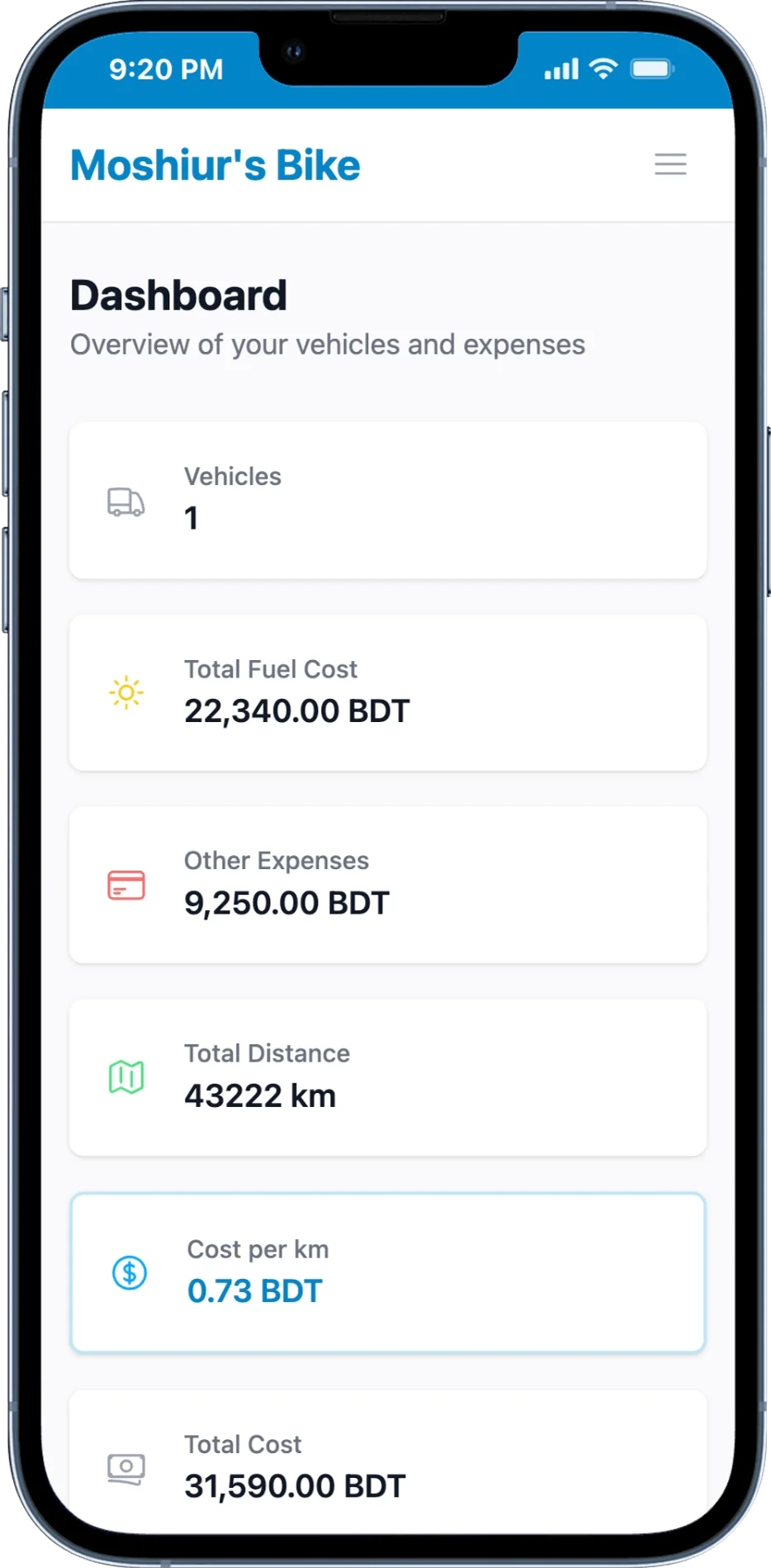
May
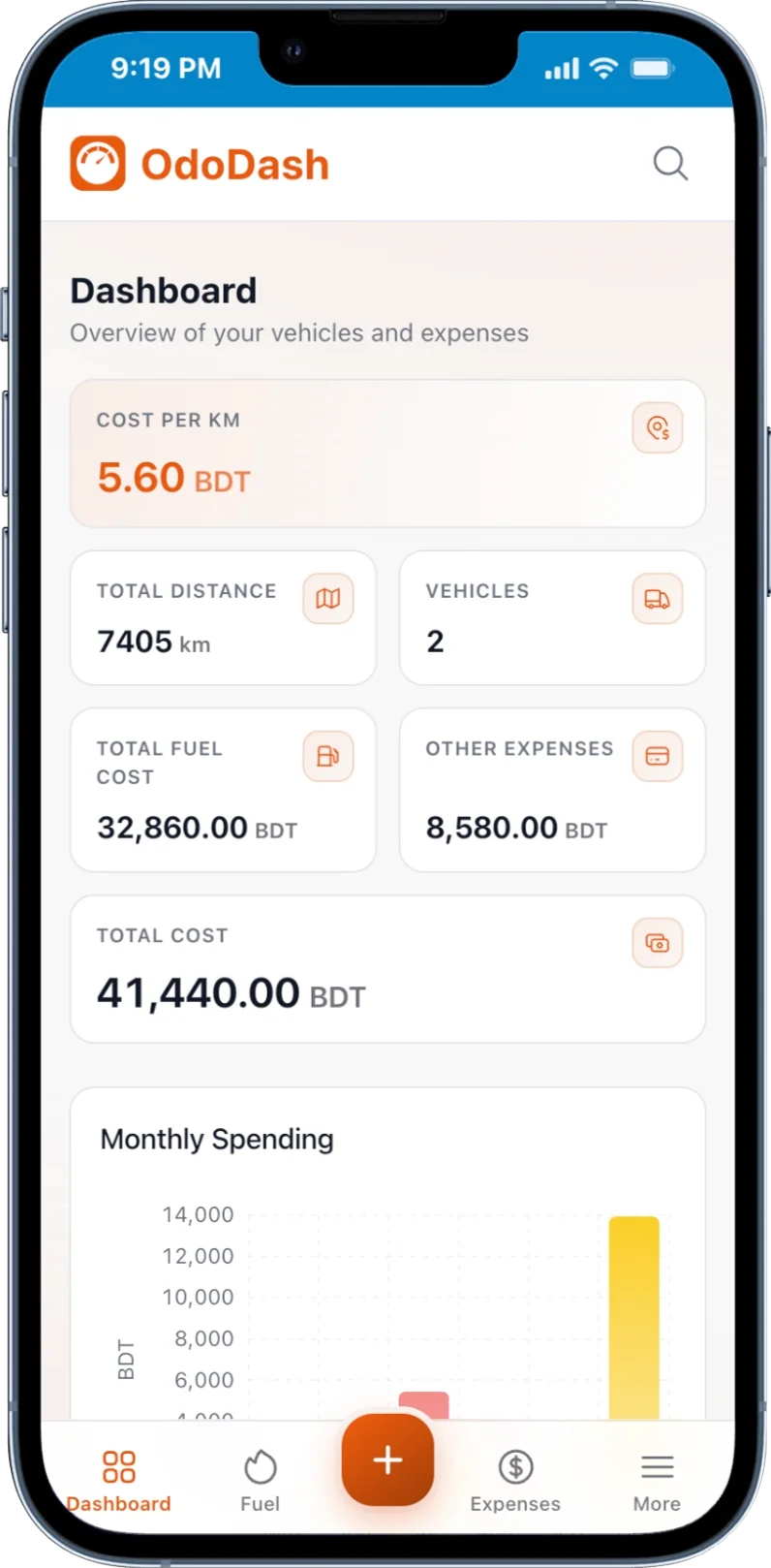
OdoDash
Better mobile and PWA experience, and maybe a proper app later. I already build the first version of PWA.
The automations that made me pick May: logging a refuel from Telegram, letting an agent read my data, and automatic backups. All through the API.
What I Learned
Pick the foundation, fix the surface. I chose the tool with the API over the one with the prettier screens. Design can be fixed later. A missing API is much harder to add.
A designer can own a codebase they didn’t write. Maintaining a fork means keeping up with someone else’s architecture, not just painting over it.
A picture beats a prompt. When words didn’t work, a Figma frame did. For me, that’s the most useful way to work with AI.